WooCommerce is by far the world’s most popular ecommerce platform.
It powers millions of online stores across the globe, which, on the one hand, tells us that it can be an excellent launchpad for your new business. On the other, it shows that it’s flexible enough for projects of all shapes and sizes.
But how flexible is it exactly?
For example, can you customize your site’s order form and checkout page?
And if yes, how hard is it?
Let’s find out.

WooCommerce’s Default Checkout Page
Putting yourself in your customers’ shoes is essential while you’re building an online store. You must ensure the site is nicely laid out, the products are correctly categorized, and the user experience is as smooth as possible.
This also means going through the entire order process. Toward the end, you’ll land on WooCommerce’s checkout page – the form you need to fill out to complete the order.
By default, the fields are:
- First name
- Last name
- Company name
- Country/Region
- Street Address
- Town/City
- State
- ZIP code
- Phone
- Email address
- Order notes
There’s also a Ship to a different address toggle which opens another form asking for yet more details.
Because WooCommerce is designed for projects of all shapes and sizes, it needs to cater to a wide range of requirements. The result is the rather long list of fields you see above.
Unfortunately, in some cases, the effects on the user experience can be rather devastating. This becomes quite apparent if you look at the order form from your customer’s perspective.
Imagine, for example, that you’re shopping for clothes from a small online retailer. You see the Company name field, and you’re likely slightly annoyed by its presence. It may be optional, but the mere fact that you have to go through it makes the checkout process more cumbersome.
It seems like a minor annoyance, but don’t forget that the devil is often in the detail when it comes to users’ willingness to spend money.
Furthermore, the long order form may leave you with the impression that the store owner is collecting quite a lot of information about you. You’ll then start to ask yourself why they need it and what they’re going to do with it.
If you’re going to run a successful ecommerce project, you have to avoid this at all cost. Privacy questions and an unduly complicated checkout process can result in a high cart abandonment rate. This, in turn, can derail the entire business.
Luckily, WooCommerce and the online community surrounding it have developed a few options for customizing your checkout page and making the order process smoother and more enjoyable.

Customizing WooCommerce’s Order Form With a Plugin
One of WooCommerce’s main advantages is the fact that the platform works on top of WordPress. This means that you can take advantage of the content management system’s modular architecture and the enormous online community that makes WordPress such an excellent site-building platform.
Open-source enthusiasts, web development outfits, and individual programmers have built countless plugins that can modify pretty much any aspect of your site’s behavior and appearance. This also includes WooCommerce’s default checkout page.
If you go to Plugins > Add new in your WordPress dashboard and search for “checkout,” you’ll see that there are plenty of options to choose from.
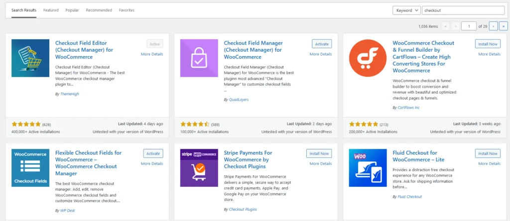
You’ll have to choose the one that suits your needs the best, install it, and customize your checkout page. Don’t forget to save the changes.
Here are some of the most popular WP plugins for editing your online store’s order form.
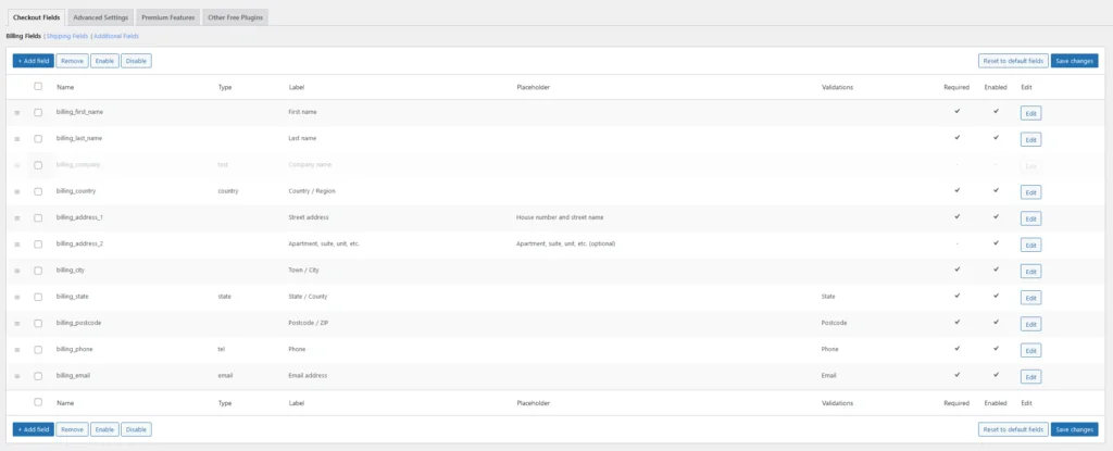
Checkout Field Editor is developed by ThemeHigh and is available on WP’s official plugin repository. With it, you can easily enable, disable, and reposition the fields on WooCommerce’s default checkout page. You can also edit the order form’s individual components, modifying their type, labels, and placeholders and choosing the required fields.
There’s also a premium version with a few extra features, including 24 additional checkout field types, custom validations, conditional sections, autofill suggestions, etc.
Prices for the paid edition start at $49 for a single website.
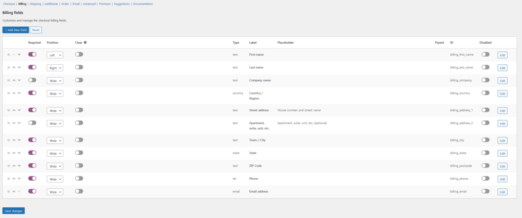
Checkout Field Manager separates all fields into categories and gives you plenty of options to play with, even in its free guise available on WP’s official plugin repository. You can decide whether your users will be forced to create an account before placing an order, choose the messages they see after completing a purchase, etc.
You can also add custom fields, radio buttons, checkboxes, date pickers, and many more. A premium version comes with a few additional features as well as some useful filtering and sorting options. A one-site license costs $49.
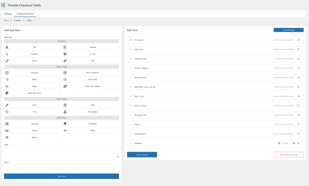
Flexible Checkout Fields’ interface is nicely laid out and easy to get used to. On the right, you see your order form’s existing fields. There’s a drag-and-drop functionality so you can arrange them exactly the way you want to, and when you click on each one, you can modify the label, the placeholder, the required class, etc.
The tools in the left-hand part of the screen let you add a new field. There are plenty of field types to choose from, including checkboxes, radio buttons, file uploaders, color pickers, etc. The pro version has yet more options and starts at $59 per year for a single website.
In addition to the add-ons above, the official WooCommerce Extension Repository has hundreds of other plugins that can help you change the way the checkout page looks or help you implement a specific payment gateway or service provider. You can have a good look around and see which ones might be suitable for your website.
Modifying WooCommerce’s Checkout Page Manually
You can also customize your checkout page by adding code snippets to your theme’s files. Doing that means you’ll have to create a child theme. If you don’t, you risk losing all your customizations during the next update.
You can add or remove fields, change their appearance, modify their behavior and do almost anything you want to your checkout page. There are online guides that tell you what you need to do, and you can even find ready-made snippets that help with specific tasks.
However, you need to bear in mind that true customizations require coding skills or help from a professional developer.
Conclusion
Your site’s checkout page is the interface clients use to place an order. Getting this far means that they’ve found what they’re looking for and are happy with the price. A lot of the work has been done, but your job doesn’t stop here.
You must ensure that the final crucial steps go as smoothly as possible. If they don’t, users will simply walk away.
That’s what makes the order form so important. Make sure it gets the attention it deserves.
FAQ
Q: Can I add custom fields to my WooCommerce checkout page?
A: Yes, you can. You’ll find quite a few plugins in WordPress’ and WooCommerce’s plugin repositories that add all sorts of fields to your order form. In addition, if you have the coding skills, you can create a child theme and edit the order form manually.
Q: Is WooCommerce’s checkout page editable by default?
A: If you open the checkout page in the WordPress editor, all you’ll see is a shortcode. If you want to modify the available fields and boxes, you need to either install a plugin or create a child theme and edit its files manually.
Q: How do I create a checkout page with WooCommerce?
A: You don’t need to. WooCommerce has a built-in checkout page that becomes available as soon as you install the plugin. If you want to edit it, you can do it either manually or with the help of a plugin.

